Case Study: /hom Smarthome Hub
Project Overview
Client
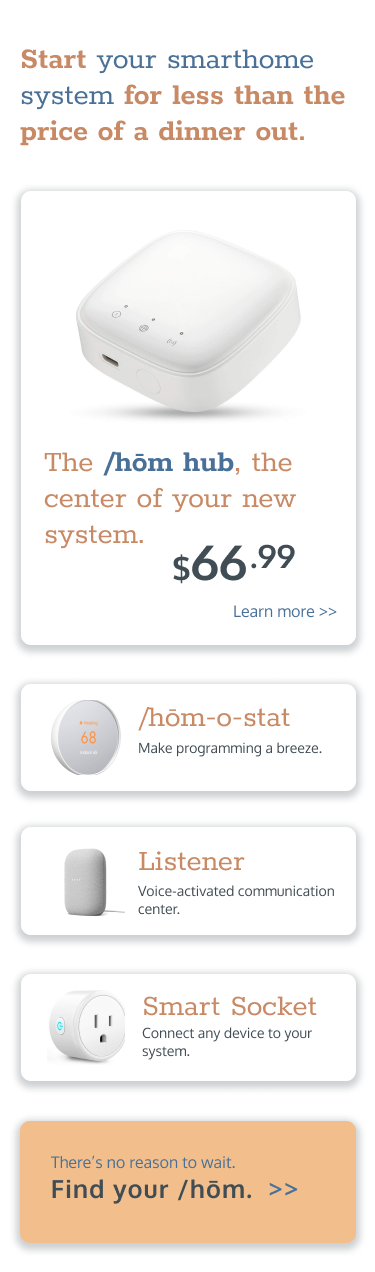
/hom markets a smarthome hub that connects climate control, lighting, security, entertainment and “smart” appliances through a centralized user interface. The product is affordable and interoperable with a wide range of devices; the primary selling point is a low barrier to entry, facilitated by a modular, expandable system design and lack of affiliation with any major tech brand.
Tools, Timeframe and Deliverables
The project was completed over eight weeks using Figma. The deliverable includes designs for the product’s welcome page for prospective customers optimized for both mobile and desktop views.
Research
Competitive Analysis
/hom’s competitors include two market behemoths: Google Nest and Amazon Echo. The most similar competitive brands are Insteon, which sells a budget-priced hub that controls climate, lighting and electrical outlets, and Ring (now acquired by Amazon), whose products are focused on home security.
The available niche among these competitors is for a broadly compatible hub that is unaffiliated with a tech giant, toward which many consumers feel some antipathy. By emphasizing the “home” in “smarthome” and de-empasizing the technology, /hom can appeal to consumers who might find the product appealing but wouldn’t consider themselves “cutting edge.”
User Interviews and Persona
Homeowners who are not currently smarthome users were interviewed to collect their thoughts on home security, smartphone usage, interaction with their climate control systems, and their relationship to the control surfaces currently in their homes. Based on these interviews, a customer persona took shape.

Mark
Mark is fairly set in his ways and hesitant to approach new technology if he doesn’t “need” it.
Bio and Demographics
53, US Southeast, Bachelor’s Degree, 80-100k, married with children in their early 20s.
Stories and Scenarios
Mark doesn’t consider himself interested in “smarthome” tech… but he does wish his current entertainment tech weren’t so “dumb.” His stereo has Bluetooth, for instance, but he can’t get it to connect to his phone. He’s slightly curious about home security cameras.
Needs and Goals
Goals: Comfort, ease of use, and dependable operation.
Needs: Few perceived.
Brand Affinities
IBM, Honda, Dish Network, Amana, Sony
Research Conclusions
- Target consumers may be more inclined to invest in the product because “it makes sense” rather than because they find smarthome features wildly appealing.
- Visual themes relating to comfort and ease will have greater appeal than themes that highlight gadgetry.
Major Decisions
Color
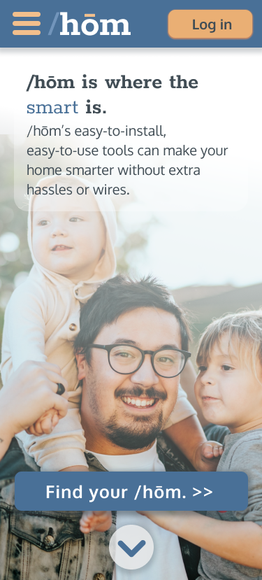
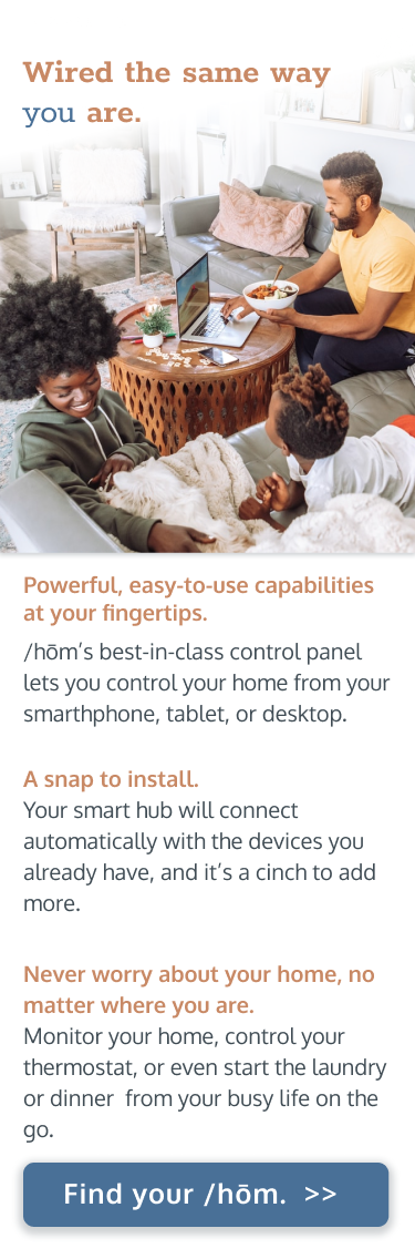
Competitive products tend to embrace more sterile colors (see Insteon, for example), with relatively character-less blues and warmer colors used only boldly and for emphasis. Based on feedback from mood boards (see Figma file here), /hom will adapt a palette of more complex, muted blues complemented by a pale orange and a darker “brick” for text.

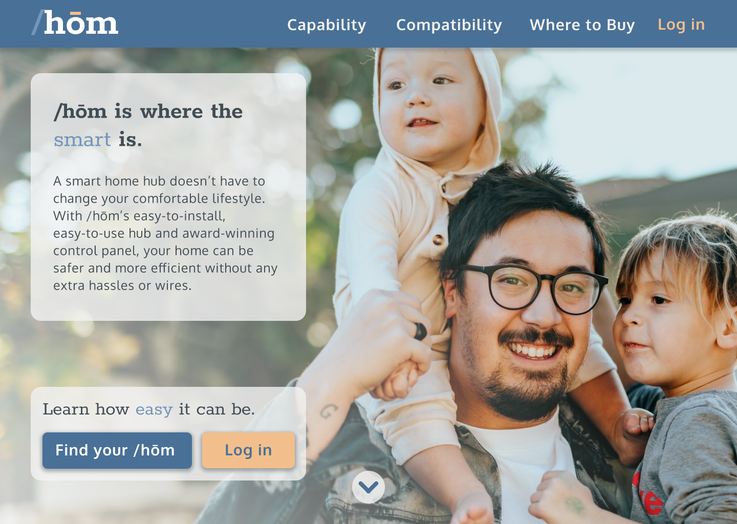
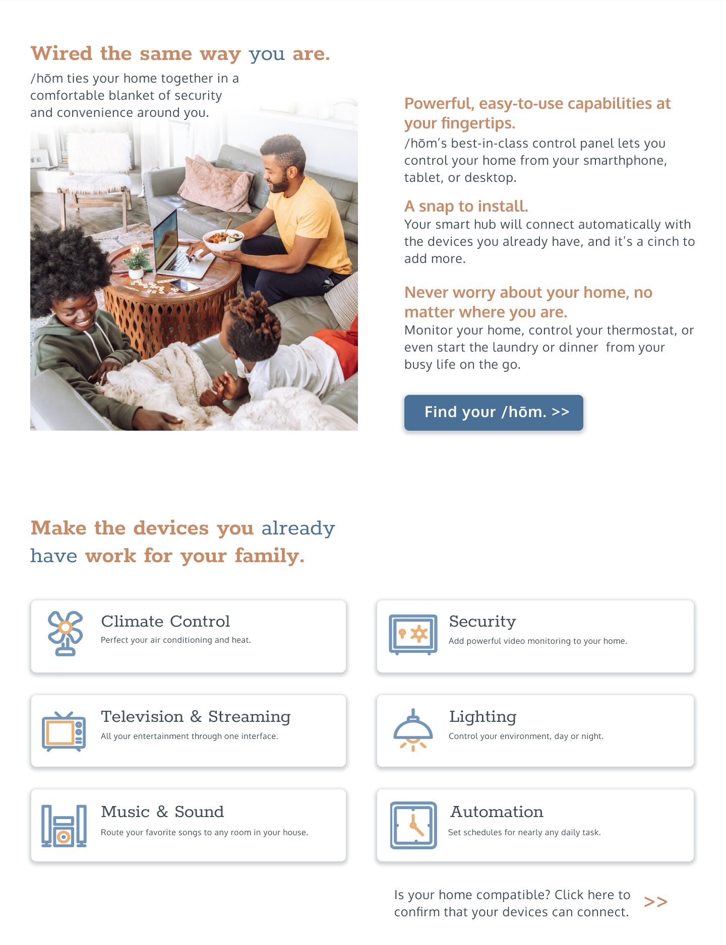
Imagery
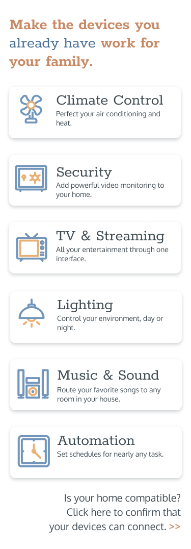
/hom and similar products are designed to be unobtrusive in appearance; as such, there’s no reason for a consumer to be drawn in by product shots. /hom’s welcome page will emphasize family interaction along with vibrant iconography to emphasize the product’s capabilities.


Typography
Tech products are almost uniformly represented by sans-serif fonts. In contrast, /hom’s primary display font will be the round, friendly Rokkitt by Vernon Adams, which features clean, stable, slab-like serifs, complemented by the same designer’s Oxygen sans-serif for body text.


Process and Iterations
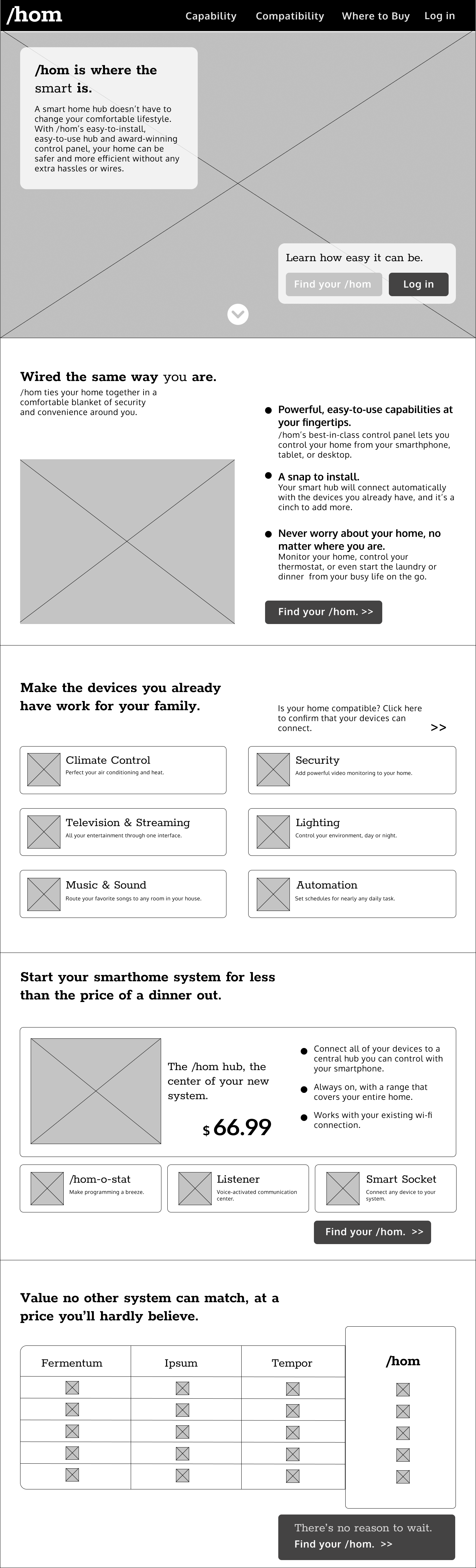
Low-Fidelity Wireframes
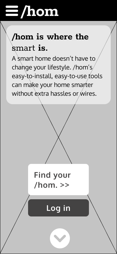
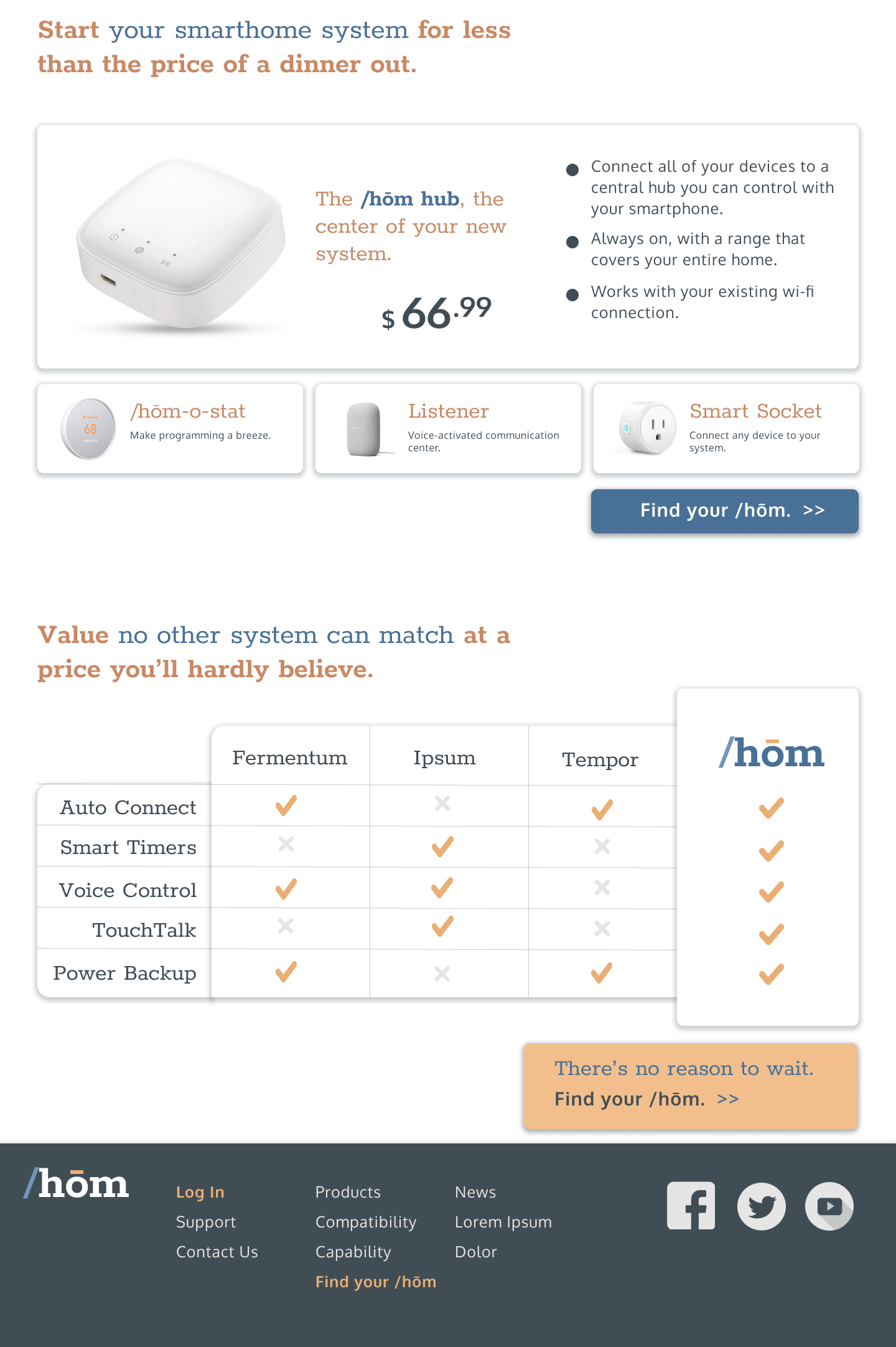
These low-fidelity wireframes with only the typography applied indicate a direction based on the conclusions above: As visitors scroll through the page, they’ll encounter welcoming imagery above the fold, soon joined by the “elevator pitch” describing the product’s primary appeal, followed by descriptions of features and capabilities, and finally a detailed description of available products. Modest call-to-action buttons on each screen invite the user to commit at whatever point they become convinced.
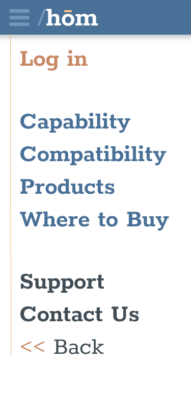
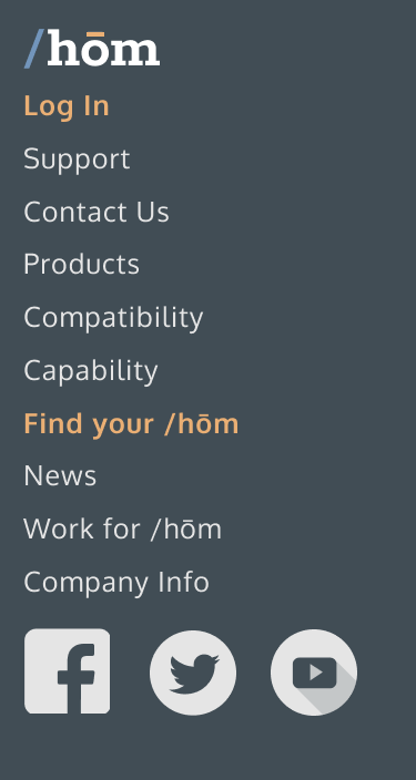
An important consideration is that both potential and existing users be welcomed; as such, a login button features prominently and somewhat awkwardly in earlier wireframes.
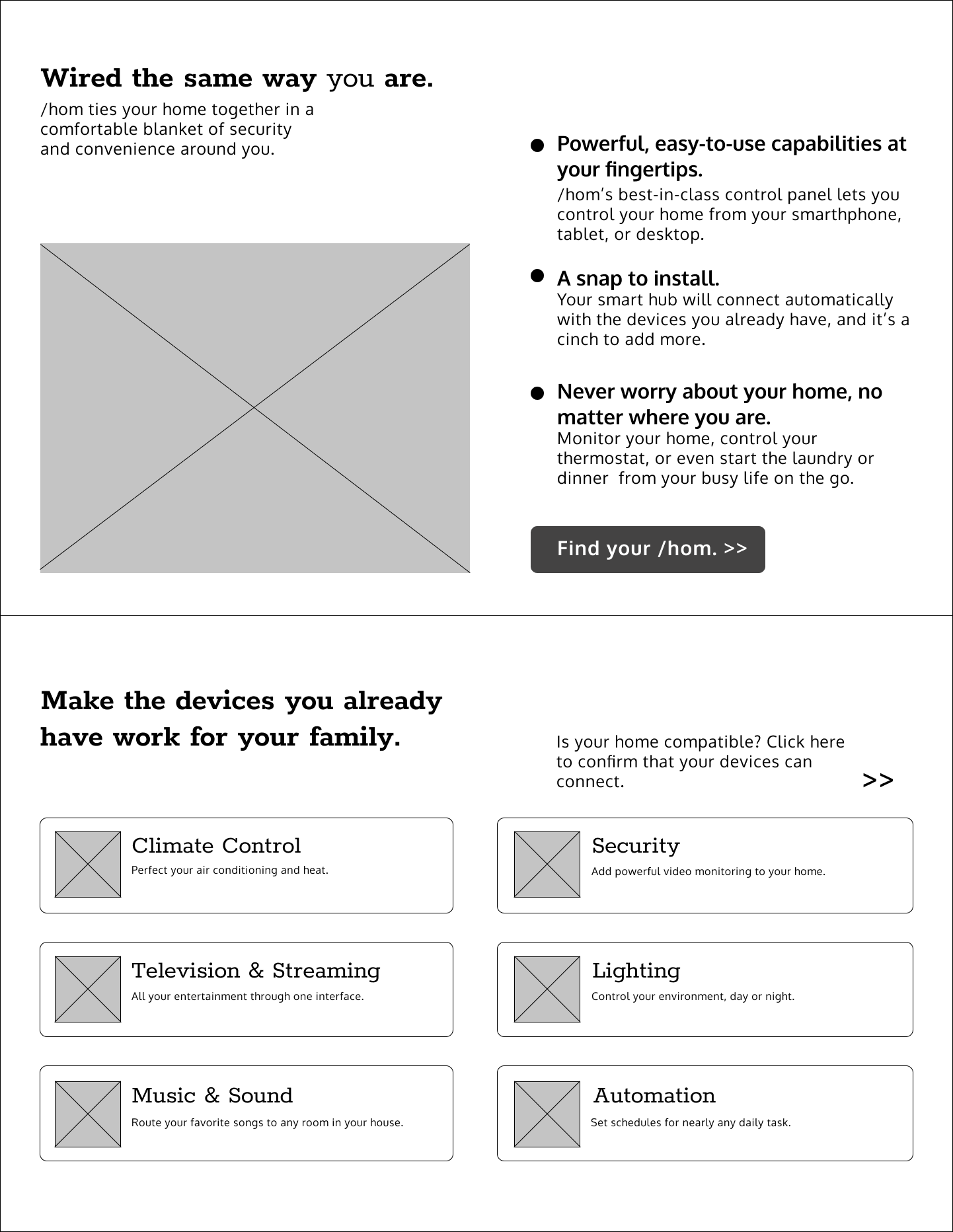
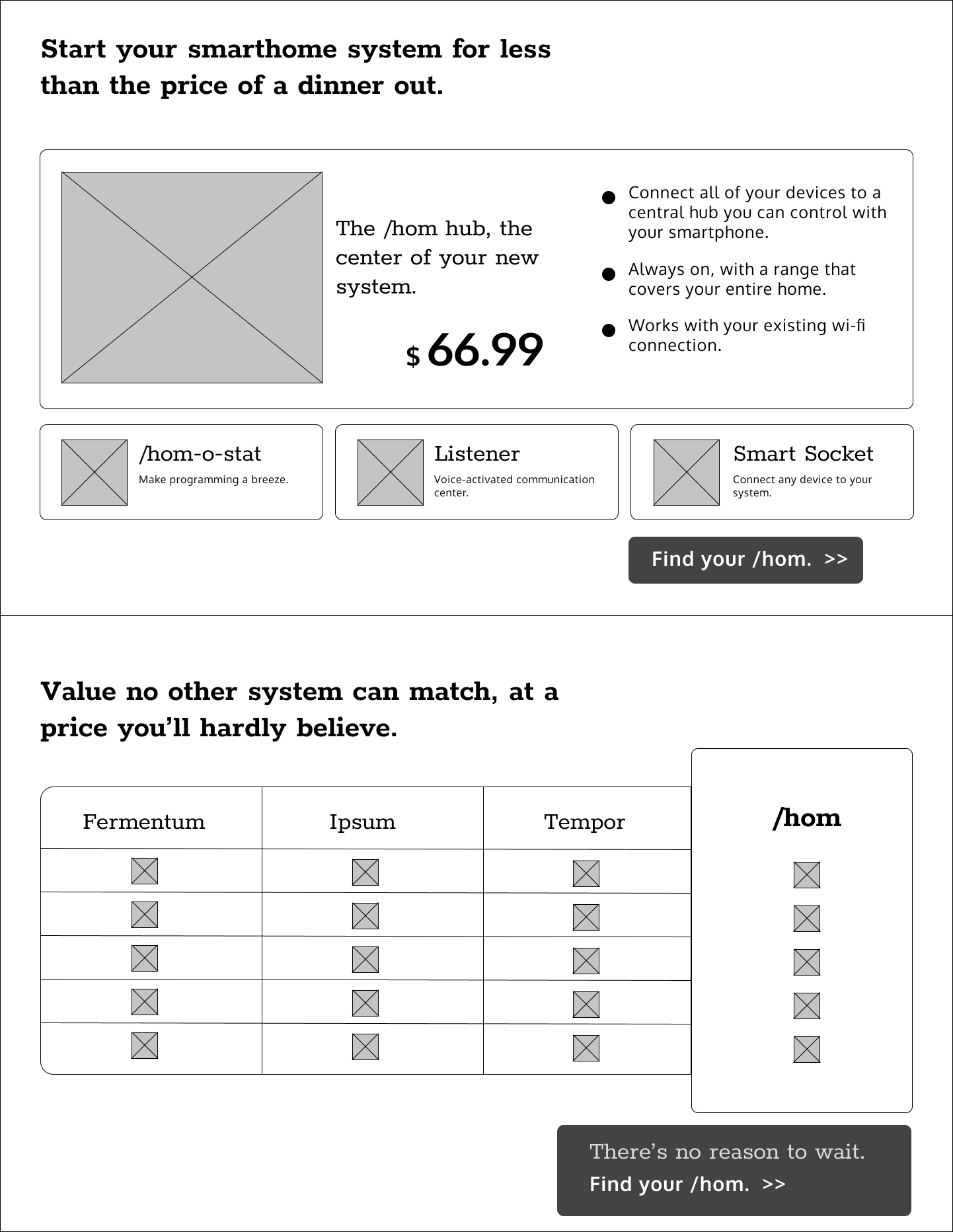
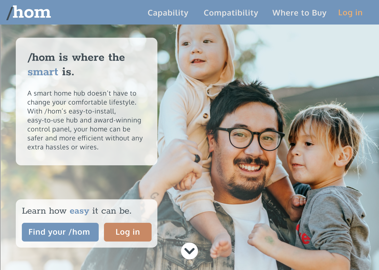
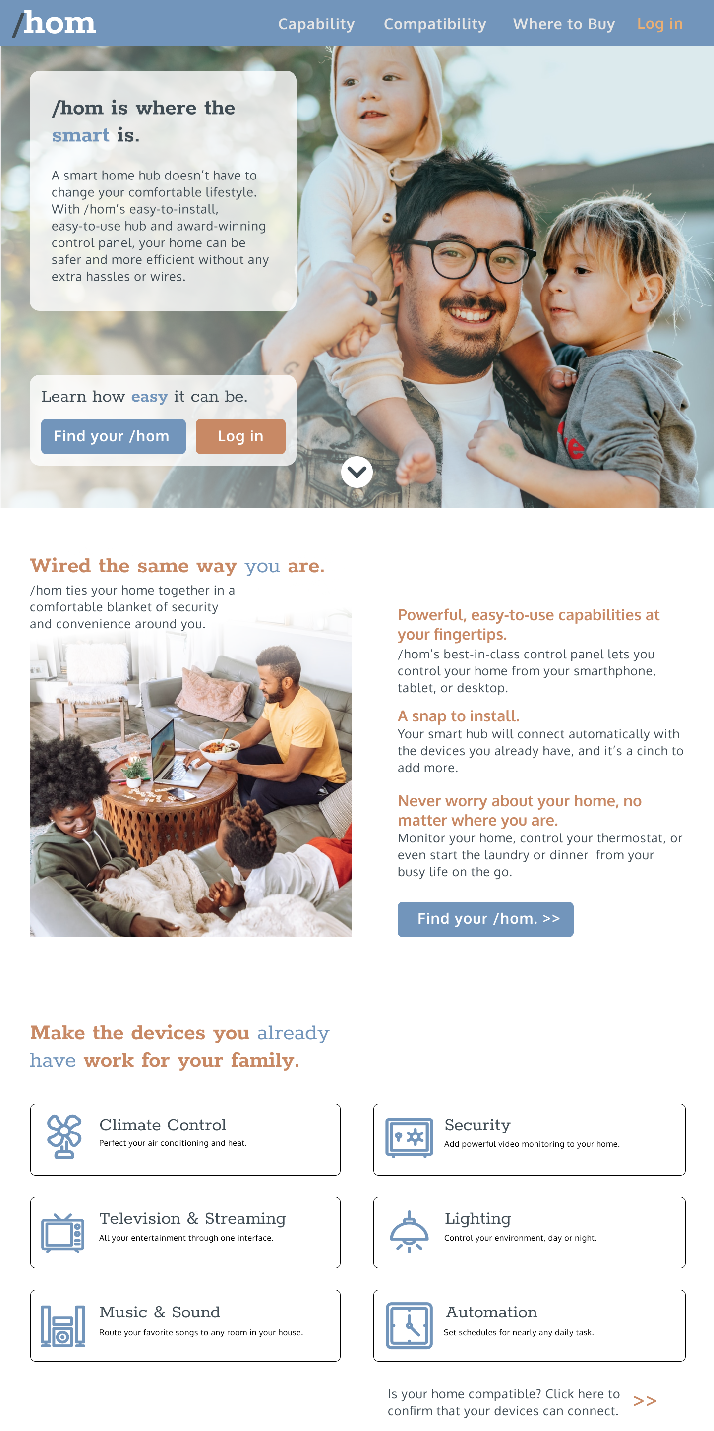
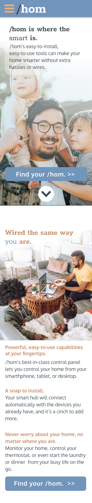
High-Fidelity Wireframes
After incorporating feedback from critiques, the alignment of call-to-action buttons was made more consistent, superfluous visual elements like bullet points were removed, and the login concern (particularly on the mobile view) was safely sequestered in a prominent place in the header.
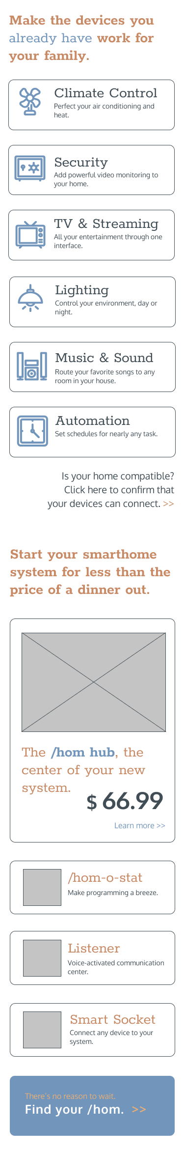
Deliverables
After some experiments with solid borders for information cards, a more conventional “elevation”-style approach was adopted by incorporating shadows. Accessibility concerns also necessitated adjustments toward higher contrast, particular in clickable UI elements.
: : View full project in Figma
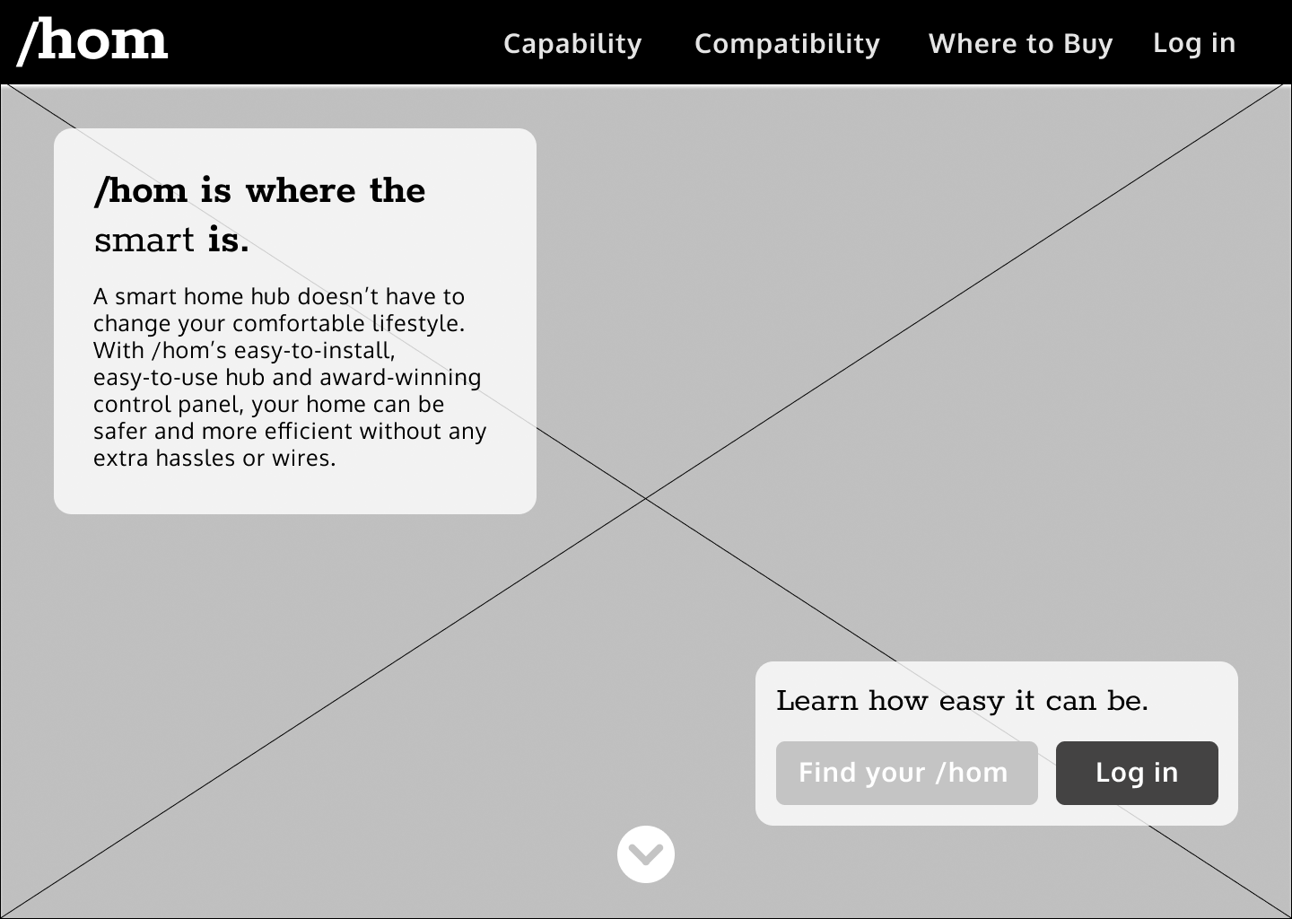
Wireframe: Desktop
Wireframe: Mobile
Further Development
Planned future improvements
- Integrate prototyping for:
- User interactions
- Sticky header
- Hamburger menu
- Develop style guide
- Incorporate device frames
- Develop control panel interface